
Data is everywhere. Truly, relentlessly, everywhere. And yet, the uncomfortable truth that haunts most organizations is this: having data is absolutely not the same as understanding it. Businesses today generate billions of data points every single day, from sales transactions and website click patterns to supply chain movements and customer support interactions. The challenge has never been collection. It has always been comprehension.
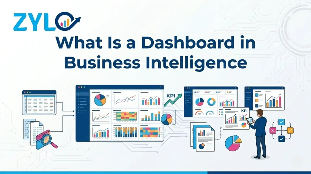
So what is a dashboard in business intelligence, really? It is the answer to that challenge. A BI dashboard is a centralized, interactive, visual interface that transforms messy, scattered data into something a human being can actually act on. It sits at the core of any serious data analytics strategy. In this article, we will explore what a dashboard truly means in the context of Business Intelligence (BI), covering its various types, core components, real-world use cases, and more. Let’s begin:
What Is a Dashboard in Business Intelligence?
A business intelligence dashboard is an interactive, visual interface that consolidates key metrics, KPIs, and data trends from multiple sources into one centralized view. It sits at the presentation layer of the broader BI ecosystem, translating complex, high-volume data into visual formats that support faster and more accurate decision-making.
Where a traditional business report tells you what happened last month, a well-configured BI dashboard tells you what is happening right now. That distinction sounds modest, but it carries enormous operational weight. The difference between reactive and proactive decision-making often comes down to the speed at which information reaches the right person.
How a BI Dashboard Differs From a Standard Report?
Reports are static. They capture a snapshot of data at a specific point in time, usually assembled manually or on a scheduled basis. A dashboard is dynamic. It refreshes continuously, pulling live data from connected sources and updating visualizations without requiring anyone to rebuild the document.
Reports answer “what happened.” Dashboards answer “what is happening and what should we do about it.” Both have value in a mature BI strategy, but confusing one for the other leads to dashboards that nobody checks and reports that arrive too late to matter.
Where Does a BI Dashboard Fit in the Data Pipeline?
Understanding the full architecture helps clarify what dashboards actually do. The typical business intelligence pipeline flows through these stages:
1. Data collection: Operational systems like CRM, ERP, e-commerce platforms, and IoT sensors generate raw data continuously.
2. ETL/ELT processing: Extract, Transform, Load pipelines clean, standardize, and move data into centralized storage.
3. Data warehousing: Platforms like Snowflake, Google BigQuery, Amazon Redshift, or Azure Synapse store structured, query-ready data.
4. Data modeling: Tools like dbt (data build tool) define business logic and semantic layers that make metrics consistent and reliable.
5. Visualization and dashboarding: Tools like Power BI, Tableau, Qlik Sense, Looker, or Metabase render data into interactive dashboards.
Dashboards live at step five. They are the final mile of the data pipeline, and they can only be as trustworthy as everything that comes before them. Weak data governance upstream produces misleading dashboards downstream. Garbage in, garbage out. That principle is old, but it never stops being true.
The Three Core Types of Business Intelligence Dashboards
Not all dashboards serve the same purpose. Choosing the wrong type for the wrong audience is one of the most common and most costly mistakes in BI implementation.
1. Operational Dashboards
Operational dashboards are built for speed and immediacy. They monitor real-time or near-real-time data, answering one urgent question: what is happening right now?
A call center manager watching live queue lengths, agent availability, and average handle time is using an operational dashboard. A logistics coordinator tracking shipment statuses across a delivery network is doing the same. The data refresh rate here is measured in seconds or minutes. Decisions are tactical, immediate, and often require no analysis whatsoever. The data speaks, and someone acts.
2. Analytical Dashboards
Analytical dashboards are built for depth. They allow users to explore historical data, identify trends over time, and drill down into the root causes behind performance changes. These dashboards invite exploration rather than just monitoring.
A revenue operations analyst comparing pipeline conversion rates across quarters, a product manager mapping feature adoption curves, a supply chain strategist modeling demand fluctuations across seasons: all of these use cases belong in the analytical dashboard category. The time horizons are longer, the insights are richer, and the design supports investigation rather than alerting.
3. Strategic Dashboards
Strategic dashboards zoom out to the highest altitude. These are the executive-layer tools, the ones reviewed in quarterly business reviews, board meetings, and leadership offsites. They track long-horizon KPIs like net promoter score (NPS), annual recurring revenue (ARR), customer lifetime value (CLV), market share, and year-over-year growth.
Strategic dashboards are not designed for granularity. They are designed to answer one overarching question: Are we moving in the right direction? Less drill-down, more direction.
4. Tactical Dashboards
A fourth type worth naming is the tactical dashboard, which occupies the space between operational urgency and strategic altitude. Tactical dashboards help middle management track departmental goals, team-level KPIs, and project milestones. They translate high-level strategy into ground-level performance visibility. They bridge the gap that often exists between what executives set as targets and what frontline teams are actually executing against.
Core Components of an Effective BI Dashboard
A well-designed BI dashboard is a decision-making engine that surfaces the right information to the right people at the right time. The most effective dashboards share a common architecture: purposeful metrics, intuitive visualizations, and reliable data pipelines working in concert. Understanding these core components is the first step toward building dashboards that actually get used.
■ KPIs and Business Metrics
The backbone of any dashboard is its metrics. A KPI is not just any number someone finds interesting. It is a measurable value that reflects progress toward a defined business objective. Revenue is a metric. Revenue growth rate relative to the same quarter last year, tracked against a forecasted target, is a KPI. The difference is context, intent, and accountability.
Poorly chosen KPIs produce dashboards that look busy but mean nothing. Every metric on a dashboard should answer the question: What decision does this support?
■ Data Visualizations and Chart Types
Visualizations are the language through which a dashboard communicates. Choosing the wrong chart type actively distorts how data gets interpreted. A pie chart with fourteen slices tells no one anything useful. Each chart type is suited to specific data relationships:
🡆 Line charts for tracking change over time (revenue trends, user growth).
🡆 Bar and column charts for comparing values across categories (sales by region, performance by product line).
🡆 Pie and donut charts for proportional breakdowns, used sparingly and only when there are few categories.
🡆 Heatmaps for density and concentration patterns (website click maps, geographic performance).
🡆 Funnel charts for conversion stage analysis (marketing funnel, sales pipeline).
🡆 Gauge and scorecard widgets for displaying a single metric against a target.
🡆 Scatter plots for correlation analysis between two variables.
■ Filters, Segments, and Interactive Drill-Downs
A dashboard without interactivity is just a poster. Filters and drill-down capabilities are what transform a static display into a genuine analytical experience.
A regional sales manager needs to slice the dashboard by territory without affecting what their colleagues see. An analyst needs to click on an anomalous spike in a trend line and drill down to the individual transactions that caused it.
■ Real-Time Alerts and Threshold Notifications
Smart dashboards do not wait for humans to notice problems. Configurable alerts fire when a metric crosses a defined threshold, pushing a notification to a Slack channel, an email inbox, or a mobile device.
When customer churn rate creeps above 5%, when inventory falls below a critical reorder level, when server response times exceed acceptable latency, the dashboard should tell someone. Automatically. Without requiring anyone to stare at a screen all afternoon.
■ Data Freshness and Connectivity
A dashboard is only as trustworthy as the data feeding it. Stale data is not just unhelpful. It is actively dangerous when decision-makers do not know it is stale. Real-time connectors, clearly labeled last-refresh timestamps, and well-maintained ETL schedules are non-negotiable elements of a reliable BI dashboard.
Real-World BI Dashboard Use Cases by Industry
Business intelligence dashboards are only as valuable as the decisions they enable. Across industries, the most effective implementations share a common trait: they compress the time between insight and action. The following use cases illustrate how organizations in distinct sectors are putting BI dashboards to work in practice:
■ Retail and E-Commerce
Retail dashboards track sales conversion rates, average order value, cart abandonment, inventory levels by SKU, and fulfillment cycle times. During a flash sale, a merchandising team might use a real-time operational dashboard to monitor which product categories are surging, shifting promotional spend within hours based on live performance signals.
■ Healthcare
Clinical dashboards monitor patient flow, bed occupancy, average length of stay, and re-admission rates. Emergency department administrators use them to identify bottlenecks before they cascade into crises. Some advanced implementations integrate with electronic health record (EHR) systems to surface population-level health trends across patient cohorts.
■ Finance and Banking
Financial services organizations use BI dashboards for risk monitoring, fraud detection, portfolio performance tracking, and regulatory compliance reporting. A risk analyst might work with a dashboard that flags unusual transaction clusters in real time, automatically triggering an investigation workflow before a fraud pattern scales.
■ Marketing and Digital Advertising
Marketing dashboards unify multi-channel performance data into one view: spend, impressions, click-through rates, customer acquisition cost (CAC), return on ad spend (ROAS), and pipeline contribution. The ability to see not just what each channel is doing, but how they collectively influence revenue, is what separates marketing intelligence from marketing reporting.
■ Manufacturing and Operations
Manufacturing operational dashboards monitor production line throughput, machine uptime, defect rates, and output against shift targets. When a sensor signals that equipment is operating outside acceptable parameters, the dashboard surfaces that signal immediately, compressing the time between anomaly detection and corrective action.
Final Words
The data has always existed. What was missing, for most of the history of business, was the ability to see all of it in one place, in real time, in a form a human being could actually use to make a decision.
That is what a BI dashboard provides. Clear, organized, up-to-date visibility into what is happening across an organization. Understanding “what is a dashboard in Business Intelligence” marks the beginning of understanding how modern data-driven organizations actually function.
If your organization is ready to turn its data into decisions, Zylo can build the dashboard that makes it possible. From custom BI design to full implementation, Zylo’s business intelligence services are built to give you the visibility your business has been missing. Get in touch with Zylo today to get started.